How to Match Your Backsplash with Your Countertops and Cabinets
A beautifully designed kitchen is more than just good looks—it’s about harmony. One of the biggest decisions in creating that harmony is how to coordinate your backsplash, countertops, and cabinets. These three features dominate your kitchen visually, and when they work well together, the result is nothing short of stunning.
Whether you're doing a full kitchen renovation or just upgrading the backsplash, this guide will help you confidently choose a combo that reflects your style, feels balanced, and adds long-term value to your home.
Why Matching Your Backsplash, Countertops, and Cabinets Matters
The kitchen is often called the heart of the home. That means it should not only function well but also feel inviting. Choosing complementary colors, textures, and materials creates a unified design that looks intentional.
An unmatched or busy-looking combination can quickly feel cluttered. On the other hand, well-matched surfaces create flow and visual comfort—two things that increase resale value and daily enjoyment.
Start with Your Kitchen Style and Color Palette
Before picking a backsplash, take a step back and define your kitchen's overall style. Is it modern, rustic, farmhouse, transitional, or traditional? Each style has its own language of color, material, and pattern.
Once your style is defined, pick a color palette. A good rule of thumb: select 2-3 dominant colors and 1-2 accents. For example, a modern kitchen might use a gray and white base with a pop of matte black or teal.
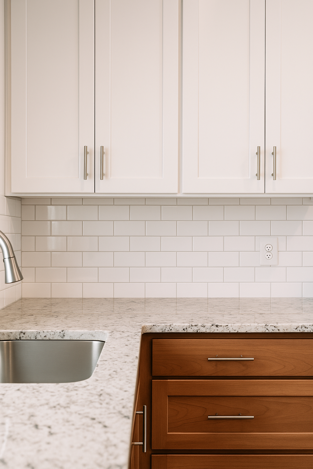
Example: If you have a white shaker cabinet and marble countertop, a soft gray subway tile backsplash blends beautifully in a transitional-style kitchen.
Should You Match or Contrast Your Backsplash with Cabinets?
This depends on your design goals. If you're going for a cohesive, calm look, keep the backsplash similar in color to your cabinets. For a more dynamic, eye-catching design, choose a backsplash that contrasts.
Matching: Works well in smaller kitchens or for minimalist looks.
Contrasting: Adds depth and interest, especially in larger kitchens.
Example: Navy blue cabinets with a crisp white backsplash and gold hardware create a bold but balanced contrast.
How to Coordinate Backsplash with Different Countertop Materials
Your countertop material affects how light reflects in your space and how textures feel. Here's how to match based on popular materials:
Matching with Quartz Countertops
Quartz is sleek and modern, often in whites, grays, and beiges.
Stick to glass or glossy subway tiles for a clean, modern feel.
Avoid overly rustic textures unless you're blending styles deliberately.
Example: A white quartz with subtle veining looks gorgeous with a white beveled subway tile and gray grout for definition.
Matching with Granite Countertops
Granite tends to have busier patterns and multiple colors.
Choose a backsplash tile that pulls a single color from the granite.
Stick to neutral or simple tiles so you don’t compete with the natural stone.
Example: If your granite has flecks of brown and cream, a solid cream ceramic tile creates cohesion without distraction.
Matching with Laminate or Butcher Block
Laminate comes in many patterns, and butcher block adds warmth.
Earth tones and natural textures like brick or matte subway tiles pair well.
Be mindful of overloading the space with wood grain if using butcher block.
Example: A butcher block countertop with sage green cabinets and white handmade-look ceramic tiles gives a cozy farmhouse vibe.
Backsplash Tile Finishes and Textures: What Works Best
Backsplash tile comes in more than just color—finish and texture matter too.
Glossy tiles reflect light, ideal for smaller or darker kitchens.
Matte tiles feel grounded and soft, great for rustic or earthy styles.
Textured or handmade-look tiles add depth and character.
Try to avoid clashing finishes. If your countertops are high-gloss, a glossy backsplash usually works better.
Color Theory Basics for Kitchen Design Harmony
Color theory can feel intimidating, but here’s an easy tip: stick to a monochromatic, complementary, or analogous scheme.
Monochromatic: All colors in one tone (e.g., various shades of white)
Complementary: Opposites on the color wheel (e.g., navy and orange)
Analogous: Colors next to each other (e.g., green, blue, and teal)
Example: A light blue backsplash with navy cabinets and white quartz counters fits an analogous scheme.
The 60-30-10 Rule for Kitchen Color Balance
This classic interior design rule helps balance color proportion in any room:
60% dominant color (usually cabinets or walls)
30% secondary color (countertops or backsplash)
10% accent color (hardware, decor, lighting)
Stick to this rule to prevent visual overwhelm and give your kitchen a natural hierarchy of color.
Popular Backsplash and Cabinet Combinations That Work
Here are some tried-and-true combos to inspire you:
White Cabinets with Bold or Patterned Backsplash
Keeps things light but adds character.
Try geometric tiles or patterned Moroccan styles.
Dark Cabinets with Light or Neutral Backsplash
Creates contrast and helps open up the space.
White or light gray tile works well.
Wood Cabinets with Earthy or Subway Tile
Enhances warmth and gives a timeless look.
Use textured white, beige, or sage tile.
What to Avoid When Choosing a Backsplash
Clashing patterns: If your countertop is busy, avoid patterned backsplash.
Too many focal points: One star is enough—either your backsplash, countertop, or cabinet color should take the lead.
Trendy over timeless: Bold choices can age quickly; choose wisely.
Tips for Small Kitchens: Light, Texture, and Illusion
Use light-colored tiles to make the room feel bigger.
Consider reflective surfaces like glass or metallic tiles.
Install your backsplash vertically to create height.
Example: In a galley kitchen, glossy white herringbone tiles can reflect light and elongate the room visually.
Using Samples and Mockups Before You Commit
Don’t rely on memory or online photos. Order samples or bring paint swatches, cabinet doors, and tile pieces together under your kitchen lighting.
Tip: Tape a few tiles to your wall next to your cabinets and countertop for a few days. Observe how they look at different times of day.
Backsplash Trends for 2025: What’s In and What’s Out
In:
Handmade-look tiles
Earthy tones like terracotta and sage
Full slab backsplashes
Out:
Tiny mosaic glass tiles
Overly glossy or metallic finishes
Cold whites with no warmth or variation
Final Thoughts: Your Kitchen, Your Personality
At the end of the day, matching your backsplash with your countertops and cabinets is about telling your design story. Whether you lean classic, bold, or somewhere in between, the right combinations can transform your kitchen from standard to stunning.
Remember, trust your instincts but lean on practical guidelines like color balance, contrast, and material cohesion. A little planning goes a long way toward a kitchen you’ll love for years to come.